Pho is my Phriend


There's all kinds of comfort food, but for me, little rivals pho (a Vietnamese noodle soup, pronounced "fuh") for sheer miraculous goodness. After a long day of work, cold, damp, and stress, Bear and I went out for pho last night. I could almost feel my immune system snap back into place. 

You're looking at a bowl of noodles, chickens, herbs, spices, sprouts, onion, basil, and cilantro, along with all the other amazing and mysterious things that make up pho.

Pho Jasmine, over on Killingsworth across from PCC, has wonderful pho, and generous portions. I recommend them.

A Fascinating Resource for a Perpexing Issue

I found a really interesting blog about copying/plagiarism vs. inspiration: You Thought We Wouldn't Notice. It's helping to fill in one of the gaps left in my education at PSU.

I came up through the anthropology program at U of O with a very strict outlook on plagiarism in academic writing. Basically, if they thought you were copying someone else's work, you would wind up in deep shite indeed. Even improper citation could land you in trouble. I was pretty much death on the subject of plagiarism, so in anything I wrote, I was incredibly careful to properly cite the source for any idea that was not my own.

In PSU's art department, things were very, very different. While they do not, in any way, encourage direct plagiarism, students are occasionally encouraged to "copy" for inspiration. I'm still very confused about the differences between artistic plagiarism vs. homage vs. inspiration, but reading through You Thought We Wouldn't Notice has been helpful in starting to sort things out. There are still a lot of gray areas, though.

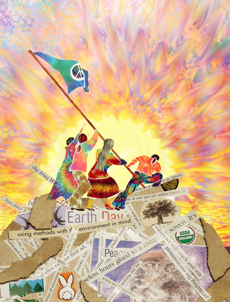
For example, I've been looking at a lot of vintage illustrations lately for inspiration:


The image on the left is a vintage magazine cover that I used as inspiration for my drawing on the right.  Comparing the two side by side, the inspiration is obvious. However, an artist friend told me that I'd reached the "changed enough" threshold for my work to be creative, rather than completely unoriginal. Should I end up selling this drawing, I would add the information about what inspired it. And that seems to just about safely cover the ethical bases for creating a derivative work.

Nonetheless, I'm still a little worried. I'm working to develop my skills as an illustrator and further develop my own creative voice, but part of that is being deeply inspired by vintage imagery and visual conventions. I'm basically an honest person, and want to make sure I stay within the spirit of ethical boundaries, not just the letter. I had a lot of fun creating this particular drawing, and I think my own visual voice comes through. As I go along, I hope to hone my sense of where the line is, and maintain my ability to stay far to the right side of it.

(Sorry about the poor image quality, I'm hoping Santa brings me a scanner for Christmas.)

In a Blur

I can't believe it's already the sixth of December! The month is going by wicked fast.

The last two weeks have been one long adventurous blur. I went on a long road trip with my boyfriend, Bear, to spend Thanksgiving with his family. We drove in the snow through the Cascades (150 miles driving on chains!), through the Mojave Desert, into Sedona and up through Flagstaff, through the mountains of Utah and Nevada, and along the Great Basin. We came through the Donner Pass (chains again), the Sacramento Valley, and home again, with many stops along the way.

I saw snowflakes and starlight, mountains and monuments, Christmas lights and cactus. It is a beautiful world out there.

Flying Calamari


I'm beginning to find some narrative in my illustrations - stories waiting to be told. This drawing gives me clues to go forward – to look for stories and find ways to hint at them in pictures. The idea of "ah, therein lies a tale" intrigues me suddenly.

As a designer, I'm used to the idea of imagery being used to communicate, usually in concert with type. Also, much of my favorite art is illustration and is inextricably tied to stories – designed to communicate in concert with words. I'm reexamining art that I like that isn't illustration. I see places and characters, but suddenly I'm also seeing stories.

Tentacley Work in Progress


Last night, I learned that giant squid are fun, fun, fun to draw! I see many tentacles in my artistic future. So far, I'm very happy with this one, although it seems to need just a little bit more. I'm thinking an inch more border to the left and above. Squidie should still be popping out of the frame, though.

The picture really doesn't do justice to the vibrancy of the colors or the texture of the water. A small, portable scanner just went on my wish list.

Autumn Woman

Autumn Woman

Another drawing, inspired by a vintage sugar wafer advertisement. Displayed with my Holztiger wolves.

M is for Mustache


And P is for Picaresque Gent, which I found on Etsy last night. Etsy is so much fun!

I'll never grow a mustache (unless what they say about some Italian women is true) but a few of my gentlemen friends sport lovely mustaches and I'm an aficionado of well-groomed facial hair. Enter good old-fashioned mustache wax.

While it was the t-shirt that caught my eye, Brandon's hand-crafted mustache waxes sound delicious: original, coconut, and sandalwood vanilla, in both "regular" and "stiff". Tins of mustache wax make great little gifts, as well, and the holidays are not far away.

I've never met this particular craftsman, but when I spotted the M is for Mustache t-shirt, it made me want to share. Support a local craftsman.

Another Sketchbook Page


I'm still obsessing with tiny houses, as you can see, which come in all shapes and sizes.

My Six Favorite Illustrators


With a few exceptions, my favorite artists have not been traditional artists, but illustrators. Because of the beautiful illustrations. I've never stopped loving and revisiting children's books. Although illustration isn't generally considered to be "serious" art, you know what I think? I think the illustrations accompanying a good story bring just as much joy and illumination to the world as any great painting, if not more.

There are so many illustrators whose work I love and adore that it's almost impossible to whittle it down to six top favorites. Seriously, with artists like Graham Oakley, Tomie DePaula, Tasha Tudor, Real Musgrave, Mary Hanson Roberts, Maurice Sendak, Leo Politi, Barbara Ninde Byfield, Barbara Lavallee and Phil Foglio, how on earth do I leave them out of the top spots? It was hard!

I find that my favorite illustrators generally all have something in common. Fluid lines, soft curves, colors that are soft or bright or rich but never garish, lots of detail but not cluttered, hidden jokes in the background, and most often a sense of humor and love and joy, words I'll mention again and again here.

Of course, of my very favorite, there was no question, but all the others? It came down to sheer joy. I love every single illustrator/artist I mention here, but here are the ones who mean the most to me and a bit about why:

  1. Nikki McClure. She is the most recent addition to my favorites, and possibly the most unconventional in her technique. Based in the NW, Nikki McClure does beautifully detailed paper cut illustrations. I love the sharp graphic contrasts in her images, as well as her subject material. She focuses a lot on simple, sustainable pleasures, and I feel like her art is about living in this place with joy and love.

  2. Hillary Knight. Probably best known for his character "Eloise", I first encountered Knight's work in the pages of "Mrs. Piggle-Wiggle" and Cricket Magazine (a huge, huge influence on me from a really tender age). He's really good at portraying movement and flow. His work always makes me smile.

  3. Edward Gorey.

    I wouldn't be me if there weren't one radically different artist on the list. Gorey's work is dark, creepy, sly and humorous. I love the neo-Victorian/Edwardian feel of his work. Very steampunk. The man himself was a flaming eccentric. Somehow, I identify just a bit.

  4. Mercer Mayer. His illustrations have a marvelously textured feel to them. Smooth, clean lines, lots of detail, lots of texture. He really can stuff a lot of detail and imagery onto a page but without ever feeling cluttered. He's got a really distinctive visual voice. It seems like his most frequent subject is fairy tales, which I've always loved.

  5. Mary Engelbreit. Sometimes dismissed as being "too cute," her work is sweetly nostalgic, soft and fun. I picked up her biography at Title Wave recently. It was a revelation. She taught herself how to draw at an early age, with loving encouragement from her family, bypassed art school and launched her career from a job at an art supply store. I was almost in tears when, looking closely at the pictures in the book, I realized I could see the marks from her colored pens. I've always thought that somehow I was doing it wrong because you could see the pen strokes where I've colored my drawings. I haven't been doing it wrong. That's huge to me.

  6. Trina Schart Hyman. My all time favorite. Another early-age encounter in the pages of Cricket Magazine, another illustrator of fairy tales. Her work was full of strong lines and misty colors. I always loved the contrast. She found a lot of magic in everyday objects and settings. I can't really explain why her work spoke to me so deeply, but there it is. She died of breast cancer in 2004. I cried when I found out. 

    Thank You!

    Yesterday was my birthday, and I received some very lovely good wishes and greetings from friends from all over. You all made my day! I want to thank you in the way I love best:


    Here's to another year of fun, friends, and creativity!

    Enchanting Animation

    This makes me happy in so many ways.

    Drawing Lab: 52 Creative Exercises to Make Drawing Fun

    Drawing Lab for Mixed-Media Artists: 52 Creative Exercises to Make Drawing Fun (Lab Series)

    I picked up an interesting book this weekend (hooray for trade credit). I've been drawing a lot lately, for fun and with the intention to hone my skills and maybe open new avenues for my career (I actually have a career! That is so exciting!).

    The book is basically a series of assignments/exercises to create some structure and direction for the practice and creation of art. Why invite structure for creative activity? Pythagoras said "Limit gives form to the limitless." Even the most creative of games have some rules; even playground games of makebelieve involve making up some rules to follow.

    The first exercise I took on was 34: Numbers Game. There's a list of animals and a list of objects. Without looking at the lists, you pick two numbers at random. Then see what you've chosen from the list. After that, you come up with some ideas for the drawing, choose the most interesting, and draw it.

    My two picks turned out to be "bird" and "bathtub."

    So much fun!

    A Favorite Part of My Job


    I have the pleasure of doing a lot of work for a wonderful company in Birmingham, Alabama, Agile Brands. Essentially, I handle most of the visual design, work closely with their web design guru, do a lot of social media work for their clients, generate html client email, and more.

    One of our biggest clients is Stack's Rare Coins, one of the oldest, most respected numismatic companies in the country. Among other things, I format and post articles to their news site and create graphics to accompany the articles. One of the challenges to that is to keep things looking varied and fresh, finding different ways to highlight the beautiful coins that the news site showcases.

    This is one of my favorite graphics that I've done for them. The coin is a beautiful Panama Pacific Exposition coin from 1915. Of all the many coins I see each week, these are easily my favorite. They are so beautiful! The background image is the front cover illustration for the official souvenir of groundbreaking by President William Howard Taft. I love it when I can work in some background imagery that involves historical provenance. It adds, I feel, to the historic interest of each piece.

    Amazing Vintage Design Resource


    The Library of Congress has a huge collection of WPA Posters online:

    The By the People, For the People: Posters from the WPA, 1936-1943 collection consists of 908 boldly colored and graphically diverse original posters produced from 1936 to 1943 as part of Franklin Delano Roosevelt's New Deal.

    Of the 2,000 WPA posters known to exist, the Library of Congress's collection of more than 900 is the largest. These striking silkscreen, lithograph, and woodcut posters were designed to publicize health and safety programs; cultural programs including art exhibitions, theatrical, and musical performances; travel and tourism; educational programs; and community activities in seventeen states and the District of Columbia.

    The posters were made possible by one of the first U.S. Government programs to support the arts and were added to the Library's holdings in the 1940s.

    I am so excited about this that it's almost silly. Good vintage design makes me really happy, though, and I've really been into art deco lately - an aesthetic that many of these pieces have. I look forward to much inspiration from this source in the future.

    Goodbye, Summer


    Taken at the fountains outside Keller Auditorium.

    Six of my Favorite Design Blogs

    One of the things I realized shortly after graduating earlier this year was that learning better design would never end, nor would the search for inspiration. These are a few of the design blogs I read on a regular basis and in which I find inspiration on many fronts, and well worth the read, too.

    1. What About Orange?
    2. Gentle Pure Space
    3. Precious Bugarin Design
    4. Kiss My Black Ads
    5. Found in Mom's Basement
    6. Grain Edit

    Little English Houses


    I mentioned having a new obsession? I found these two little porcelain houses at the thrift store. Aren't the subdued colors elegant? They are stamped "Mudlen End Studio, Felsham Suffolk, England." They're just the right size to lurk on the edges of my bookshelves, for now. They might find a new home later on.

    Pumpkins' Process

    Fall weather has come to Portland with a vengeance. And by vengeance, I mean raining ridiculously. Can you tell I don't like it much? While I do like autumn, in all its sweet, mellow glory, the rain bums me out. Especially because we had about eight weeks of summer this year and no spring. But enough complaints about that (for now).

    I'm excited to have "during" and "finished" pictures of a little art project to share. It's not a really big deal project or anything, only a bit of me putting pen to paper for my own pleasure.

    Pumpkin sketch in progress:


    Pumpkins colored in:


    As I said, not a big deal, just a bit of fun that made me smile and think of the good things about fall. While I wish the picture quality was a little better, I don't wish it enough to get out my camera and set up proper lighting. I do like things that reduce the barrier to getting things done, like my laptop's camera and my phone. As I get used to the idea of not taking "perfect" pictures, you may see me post more often, ha ha.

    A Rising Obsession


    I'm more and more obsessed with representations of houses lately. The other day, I got the urge to do some pen-to-paper drawing (take THAT, shiny little Mac!) and like a mashed potato-frenzied Richard Dreyfuss, I found myself drawing cottage after cottage. This is the first, rendered in a rapid sketchy style with something less than reverence for line and perspective, but still somehow satisfying.

    The Hippies Were Right - Illustration


    This remains one of my most favorite of all the illustrations I've ever done and I'd really like to do more like it. Editorial illustration is tremendously fun, not to mention challenging. See this piece in context here.

    Things To Do In April

    1. Put one thing in the discard pile every day.
    2. Pick a design book from my shelf and go through it with sketchbook in hand. Inspiration, I invite thee in.
    3. Re-establish an exercise routine. Bike. Walk. Stretch.
    4. Figure out what I want to say, who I want to say it to, how I want to say it, and where to say it.

    I need to get this blogging thing sussed out. As I grow as a graphic designer, I'd like an informal way to communicate with separate but possibly overlapping communities: people whose work/lives/play inspire me, people who find my stuff interesting, and people who are interested in hiring me to do work for them. That may mean a more formal blog attached to my website or maybe continuing here. We shall see.

    Monster Brisé


    As a designer, I find myself wanting to do more illustration. I love to create the images that can go along with type, help to convey a message, or simply be enjoyed as art. I like that I have a wide range of illustration styles, which I'll be exploring further here over the course of the year. This piece, Monster Brisé, is a bit of whimsy that was born in my sketchbook and finished in Illustrator and Photoshop. I'm particularly happy with the soft colors, and the cuteness of the monster-child and his chicken. The words in French are "confused," "broken" and "delicate."